
Problem
150+ pages grown by many hands, navigation that confused instead of guiding, and five departments with five ideas of who the site was for.
Universidad Nacional de Colombia is one of the country's top public universities, and its Palmira campus runs almost like an independent republic. Its website had more than 150 pages, half a dozen regulations to comply with and strict brand manuals. Five departments shared the budget, and each pulled in its own direction: communications knew what the site needed, faculty wanted something else. We led the redesign, product design and project management, and wrote the manual that keeps it consistent. We don't usually take government work; the bureaucracy and the back and forth never end. We made an exception for a university we have a soft spot for.
150+ pages grown by many hands, navigation that confused instead of guiding, and five departments with five ideas of who the site was for.
An information architecture built for applicants and defended through every review, four depth levels, one subdomain, and a UI kit inside UNAL's brand rules.
A Figma manual with 750 component variants, 885 design tokens and home templates for desktop, tablet and mobile. A system stable enough to last and ready to grow with the university.
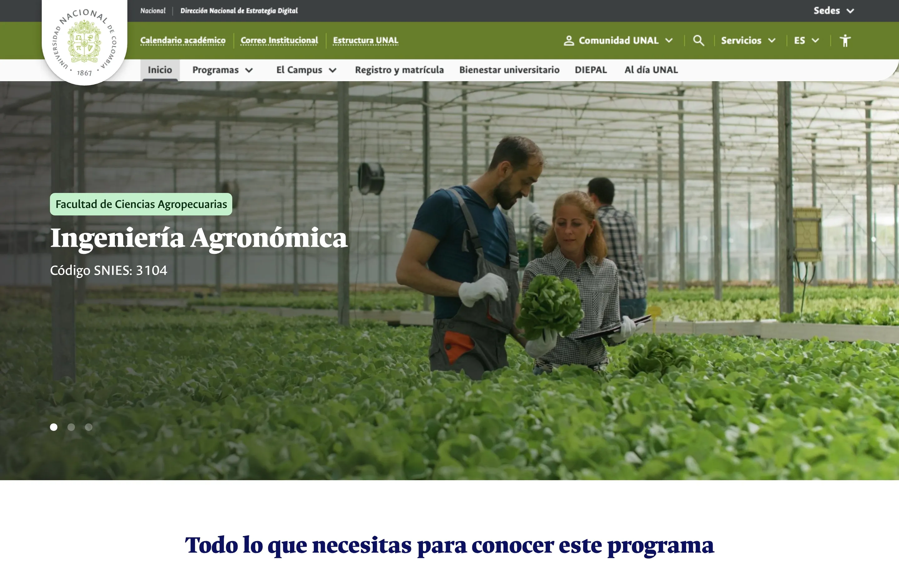
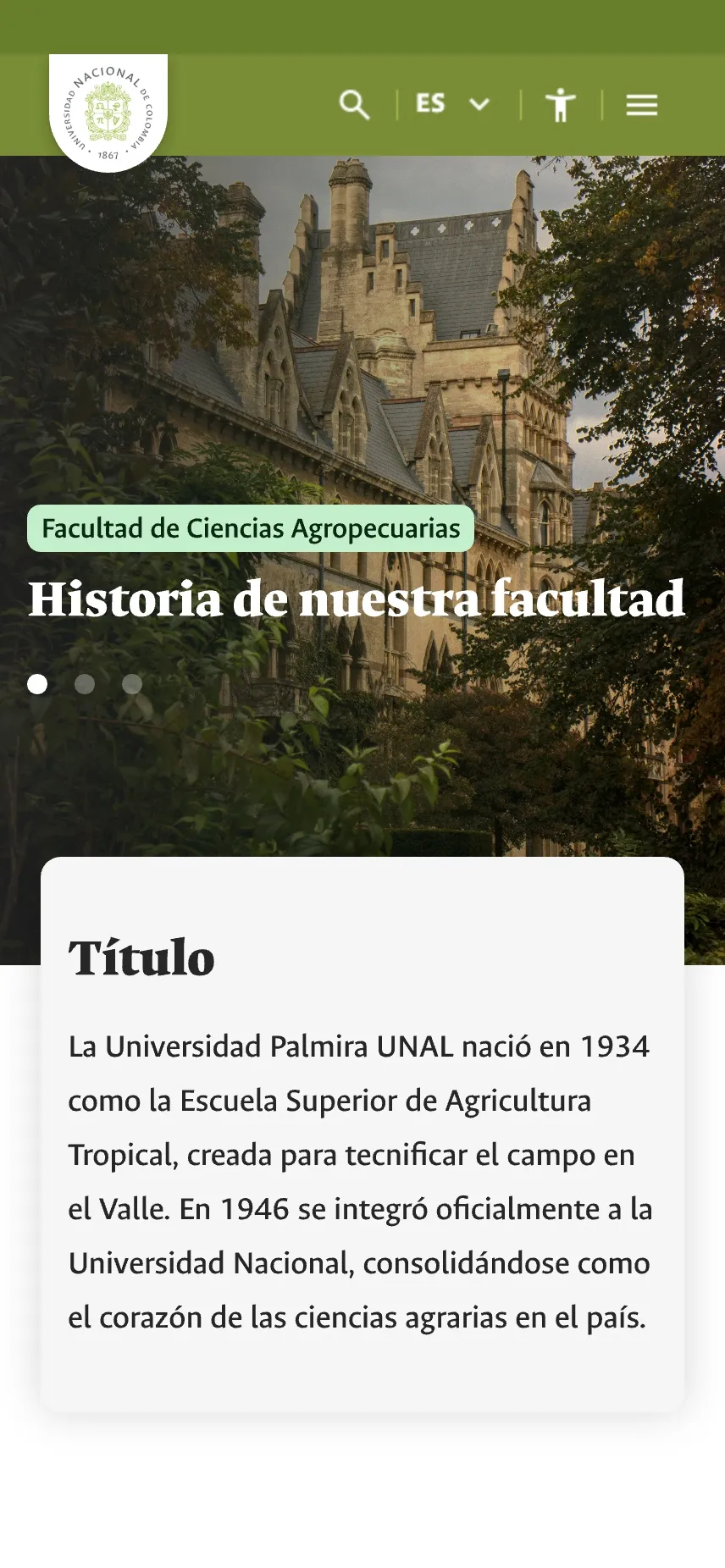
How do you redesign a website for applicants when five departments are paying for it and each wants it to be about them?
Five departments funded the project and each arrived with its own priorities. Communications knew what the site needed; faculty wanted something else. If every request had made it in, we would have redesigned the website for the org chart instead of for the people trying to apply.
Most visitors come for one thing: the list of programs. The proposed sitemap starts there and follows Hick's law, fewer choices, faster decisions, so an applicant reaches their program and the contact channels in under three clicks. We worked it as pure structure, with no visuals, and it had to be defended more than once to stay that way.
When everyone is paying, the user is the only one without a vote. The architecture was how we gave them one.
Level 1 is the home page. Level 2, the campus's own main categories, like Programs or Registration. Level 3, the sections inside them, like a program's detail. Level 4, specific content and everything that lives in the footer.
A criteria matrix tells anyone adding a page which level it belongs to, based on how people reach it and how important it is. The limits are explicit: never more than four levels, and level-4 pages never link further down.
Four clicks, maximum. And breadcrumbs from level 3 on, so nobody gets lost on the way back.
The home. Everything is in view, a scroll or at most one click away in the top header.
The main categories of the campus's own top menu, like Programas, El Campus or Registro y matrícula.
The sections inside second-level pages, like the detail of a program.
Specific content, reached from third-level pages, like a faculty's projects or history, or from the footer.
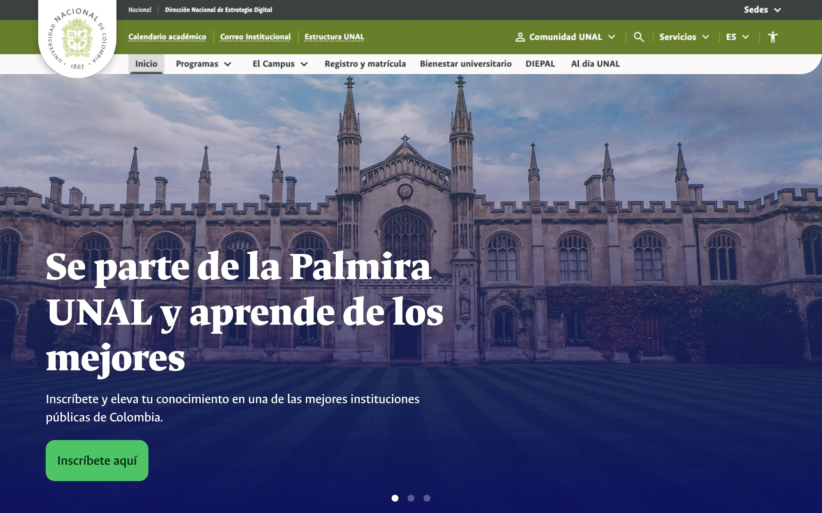
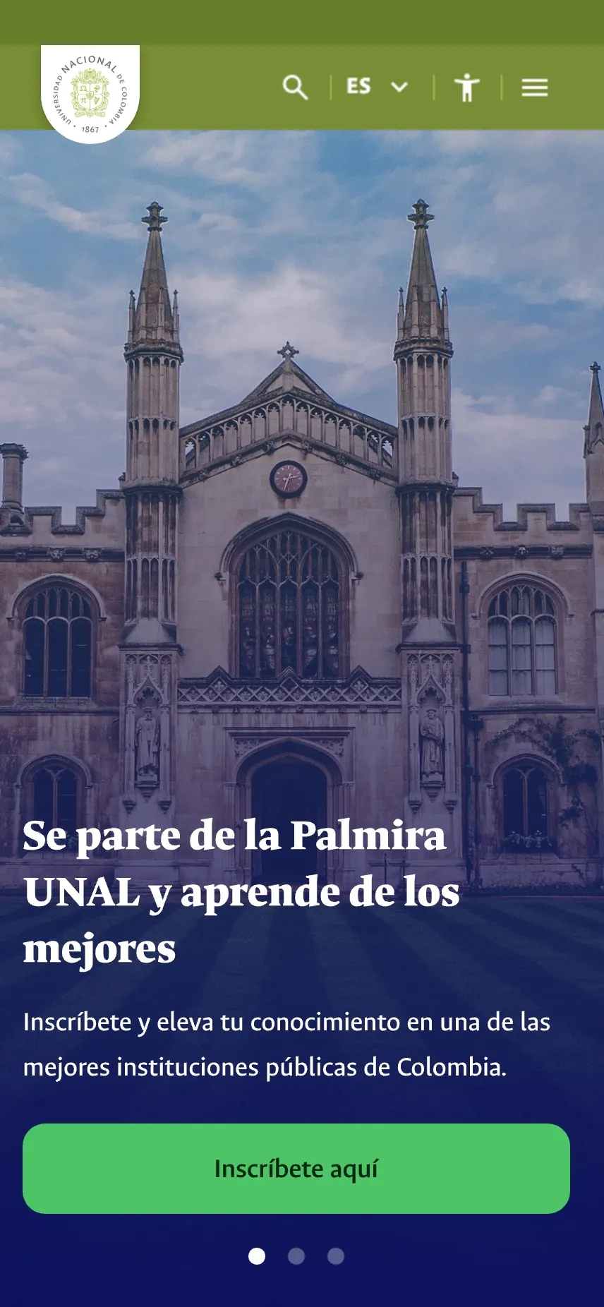
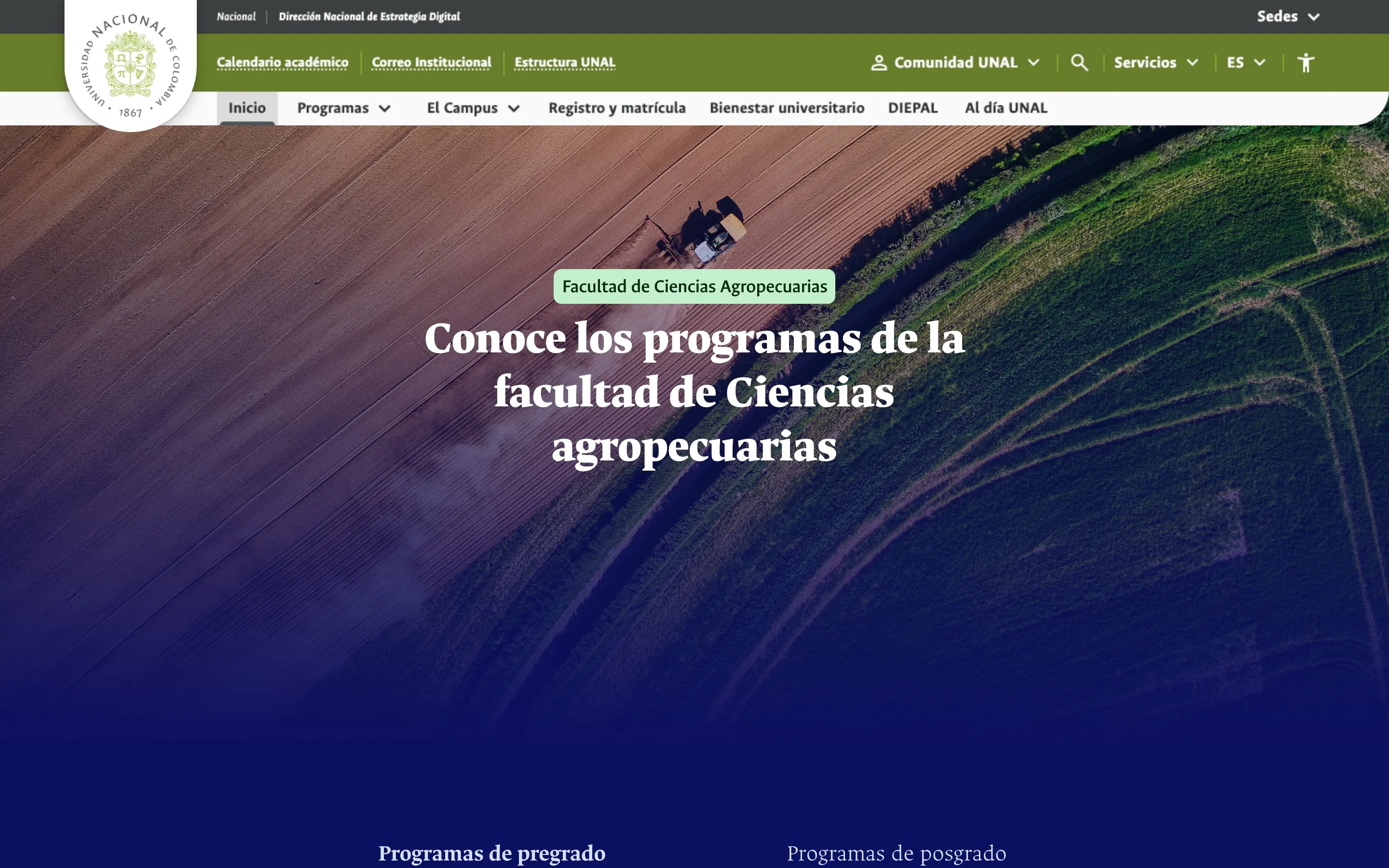
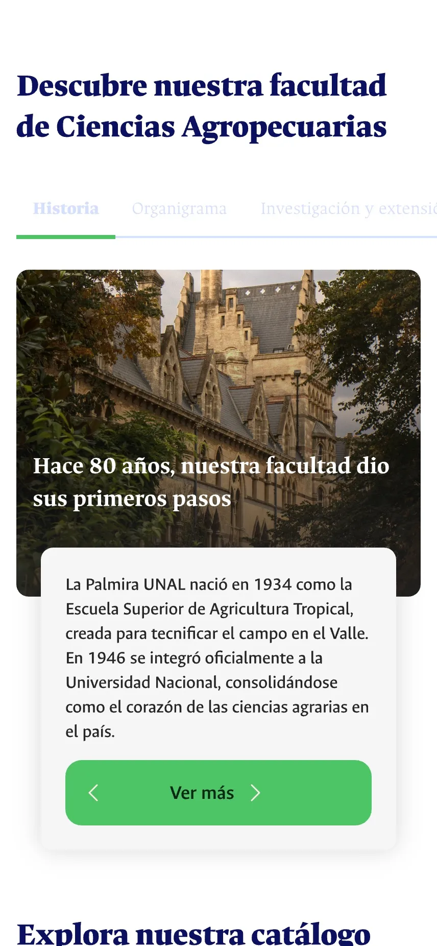
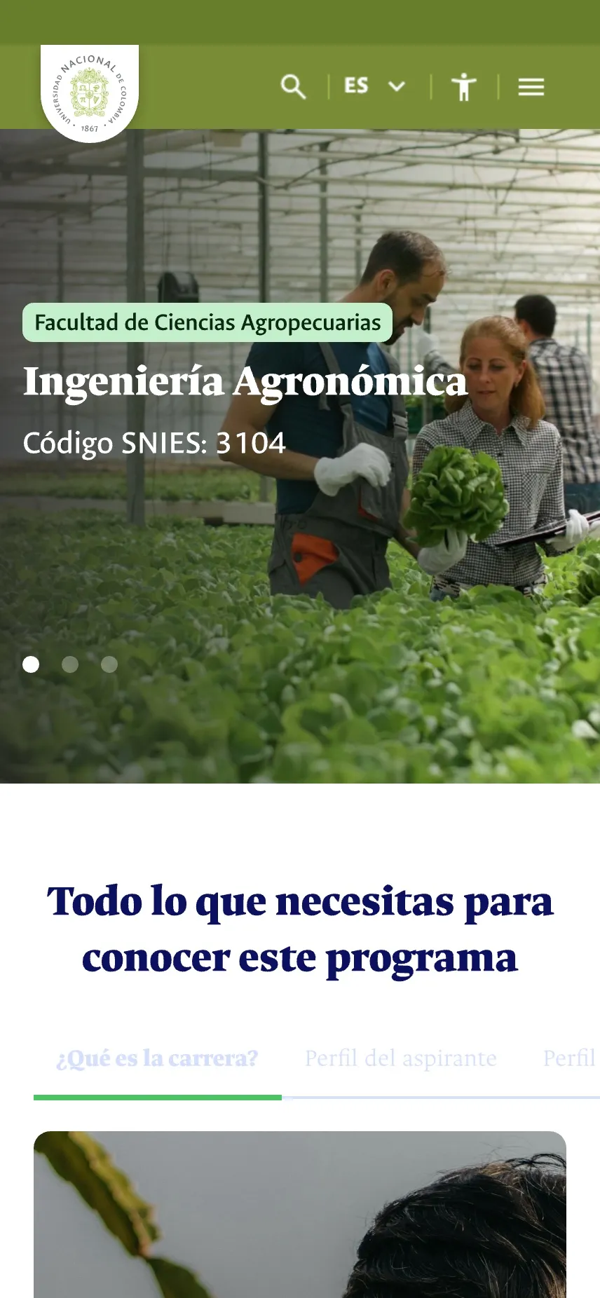
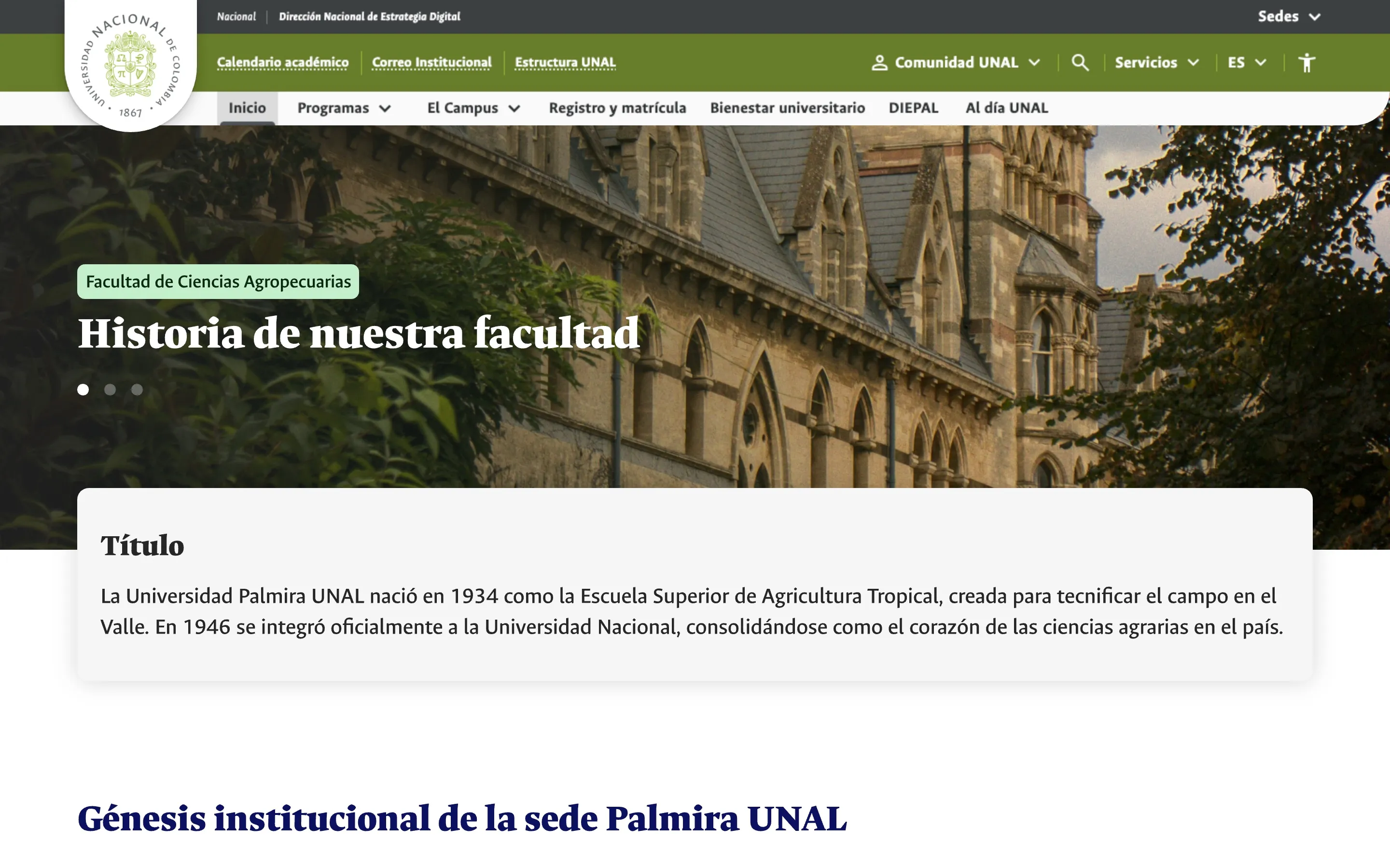
Visual hierarchy. Levels 1 and 2 use the most prominent components of the UI kit: banners and mega menus.
Footer placement. Everything at level 4 that isn't critical to applying lives in the footer, to keep the main navigation clean.
Route consistency. A user on level 3 can always see breadcrumbs that take them back to level 2.
Never more than four depth levels, or four clicks.
New content is always reached from the top or bottom menus. Fourth-level pages don't link to child pages; if they link at all, it's to pages on the same level or above.
Faculties, offices and labs had grown their own subdomains, each with a different menu and often its own WordPress install. Moving between them felt like leaving the university.
The routing standard keeps a single subdomain for the campus, palmira.unal.edu.co, with everything else as folders under it. It adds naming rules for URLs: full names without connectors, hyphens only, 40 characters at most. It goes further than UNAL's national web guide on purpose, to stop new micro-sites from appearing.
palmira.The only subdomain for the campusunal.edu.coOfficial domain/facultad-ciencias-agropecuariasLevel 2 · the campus's own categories/ingenieria-agronomicaLevel 3 · sections of the category/plan-de-estudiosLevel 4 · additional informationLevel 2
/facultad-ciencias-agropecuarias/campus/registro-matricula/bienestar/diepal/al-dia-unalLevel 3
/ingenieria-agronomica/planeacion-estadistica/estudiantes-pregrado/comite-de-genero/investigacion-y-extension/nombre-del-articuloLevel 4
/plan-de-estudiosNot every page reaches level 4; it depends on its content and depth.
www.palmira.unal.edu.co/bienestar/index.php
palmira.unal.edu.co/bienestar
UNAL has a national web guide, an identity manual and its own typeface, Ancízar, and the Palmira campus has its own brand guide on top. None of it was optional. So every decision started from those documents and was cited in the manual, so nobody could dismiss it as taste.
The campus palette leans on green for Palmira's agricultural history. We abstracted it into a web palette: primary green, secondary navy and tertiary orange, each on a 10-step scale, plus semantic and neutral colors, all named as design tokens. Every text and background pair was checked against WCAG AAA, 7:1 for normal text.
Primary
Emerald, step 40
#4DC466R 77 G 196 B 102
Secondary
Arapawa, step 100
#0C1060R 12 G 16 B 96
Tertiary
Tree poppy, step 40
#FF9A16R 255 G 154 B 22
Neutral #262626, step 100
Primary
On-primary
Contrast ratio7.08:1
Primary-hover
Primary-focus
Primary-container
On-primary-container
Primary-inactive
On-primary-inactive
Primary-text
Primary-low-emphasis
On-primary-emphasis
Primary-high-emphasis
Following atomic design, the kit covers text styles, buttons, forms, feedback, cards, containers and navigation, all set in Ancízar Sans and Ancízar Serif, the university's own typeface.
On top of it sit four home templates for desktop, tablet and mobile, a template for each depth level, breakpoint rules with safe areas, and a closing chapter on image weights, metadata and heading order for search engines and screen readers.
A UI kit is not a design system. The manual says it plainly: without connected code and usage docs, it's a library. Saying it out loud set the right expectations.
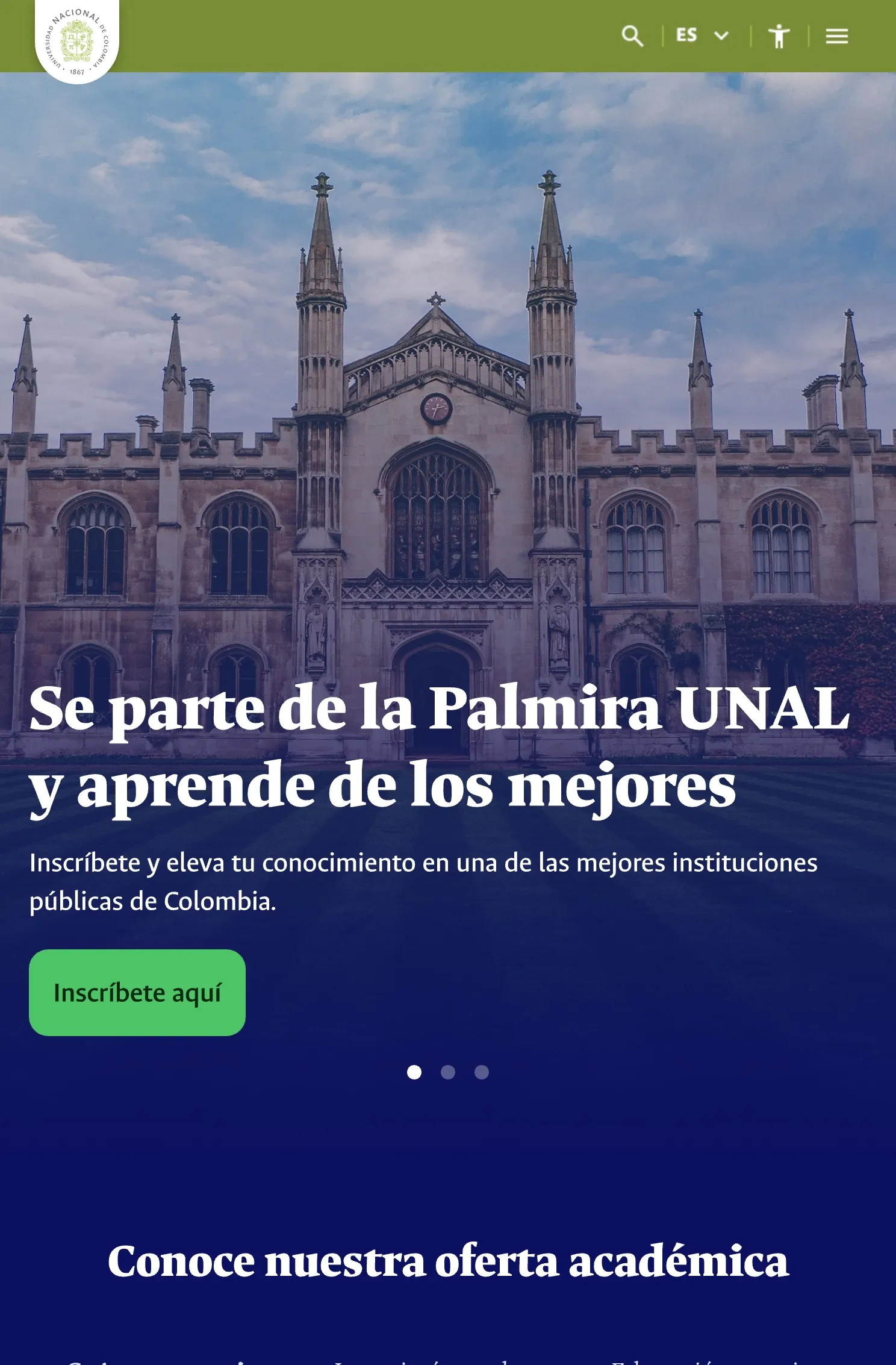
Desktop80px or 5%
Tablet40px or 3%
Smartphone16px or 2%
Safe area inside the edges of each screen. Nothing goes outside it except carousels.
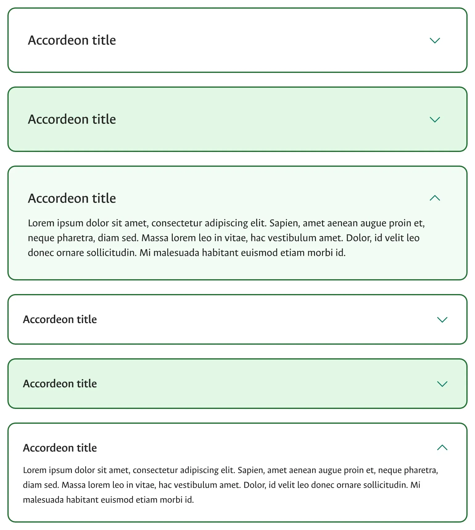
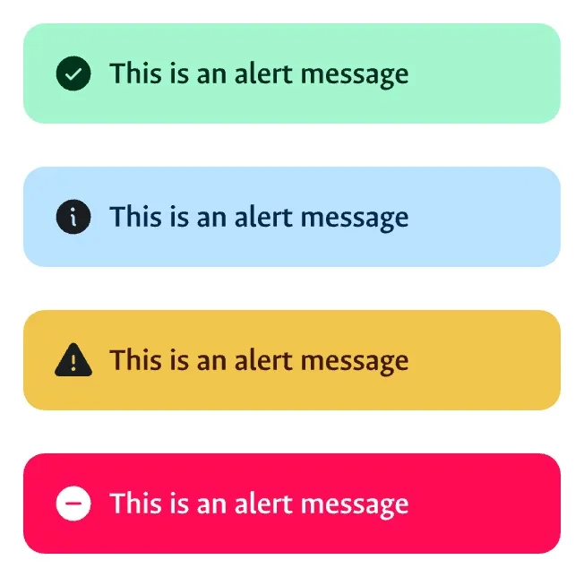
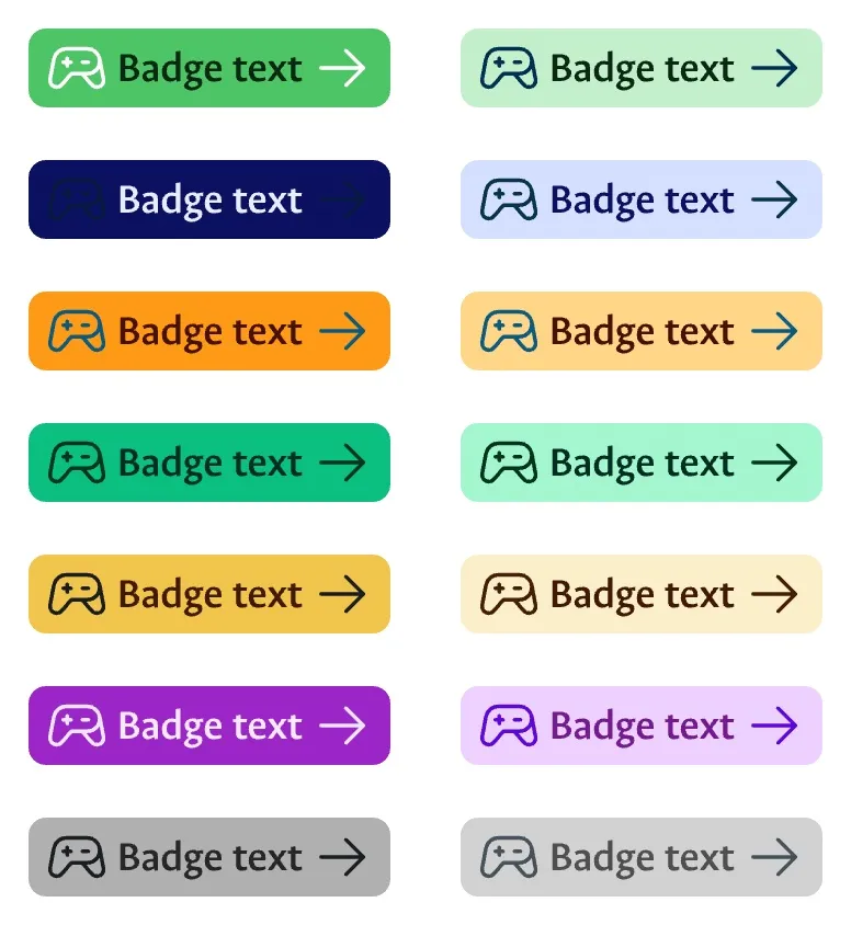
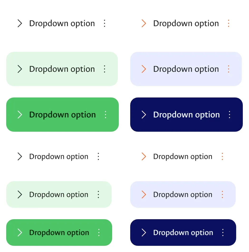
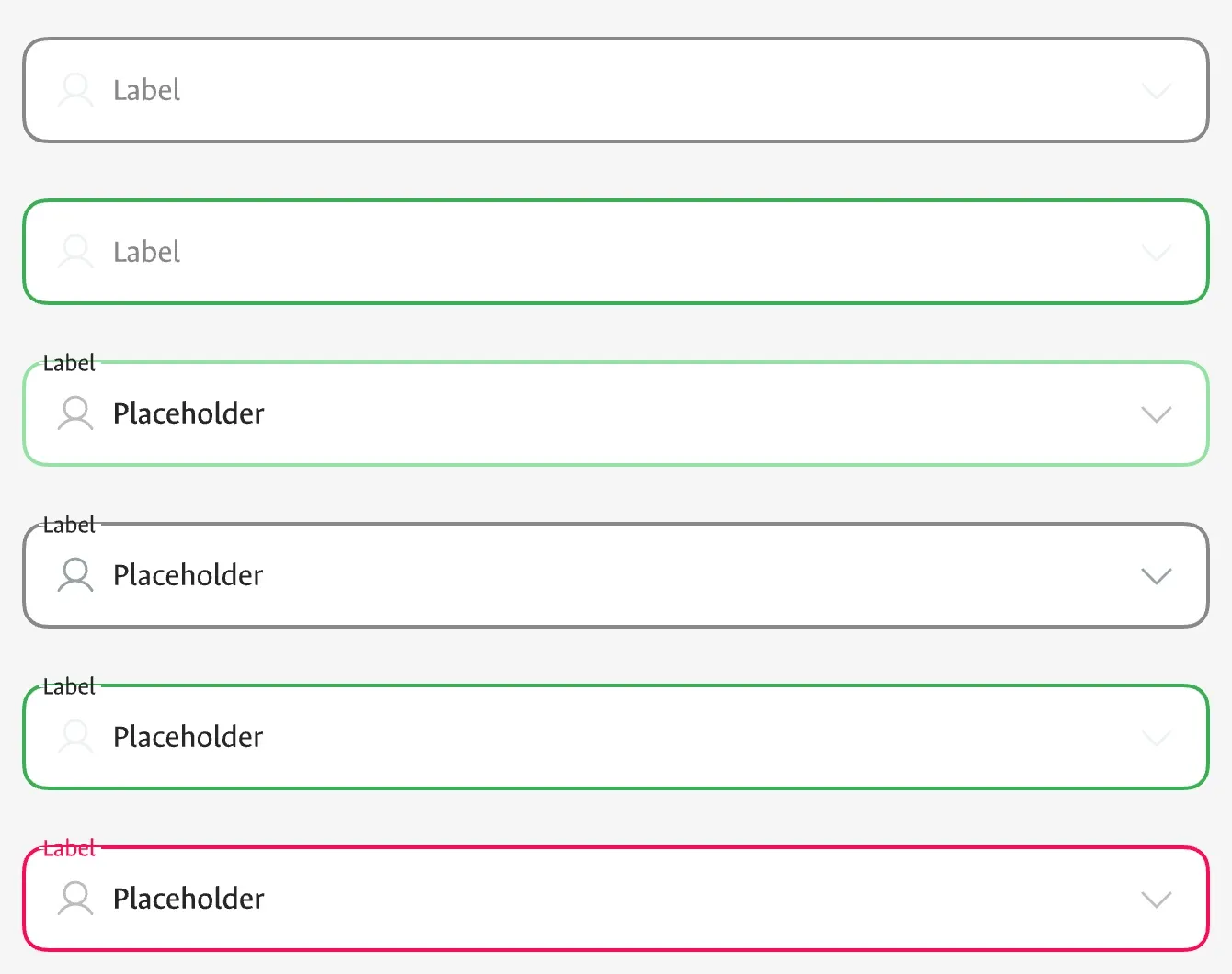
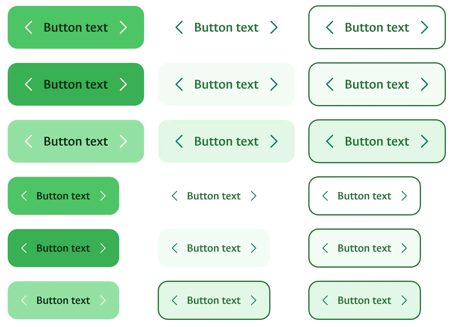
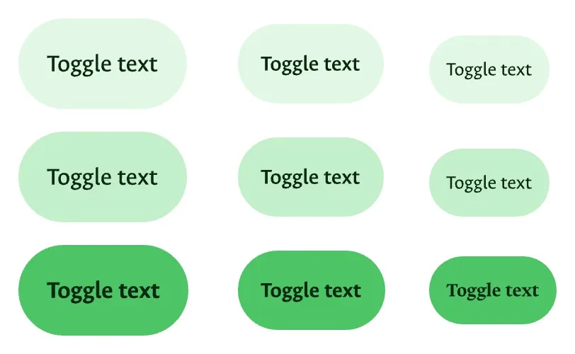
The result is a system that holds: stable, solid and built to scale, shaped around how the university actually uses its website and how its own team keeps it running. It ships as a manual in eight chapters, from brand foundations to SEO, written so a designer or developer who wasn't in the room can add a page and keep it consistent.
With five departments paying, our opinion was just one more vote. The rules they had already signed were the one argument nobody could outvote.
Designed and documented for Universidad Nacional de Colombia, Sede Palmira.
